


experience expertise
Business & IT consulting services
We challenge and enhance the way businesses leverage high-end expertise
For companies
What’s your challenge? Learn more about the services and different delivery models we offer.
For consultants
Are you among the best in your field? Learn what it’s like to work with emagine and find your next dream project.
High-end business & IT consultancy services
Advisory & Solutions
Go from strategic initiatives to tangible results. We specialize in advising, driving change, and creating value across our expertise areas.
Staff Augmentation
Extend your team and scale with proven high-end business or IT consultants selected to be the very best in their field.
Training & Courses
Bespoke training to enhance organizational and team performance, including courses and certifications.
Managed Services & Managed Teams
Enhance your development, support, or operation with our Managed teams and services. We customize the service depending on your situation and requirements.

Delivery with a bestshore approach
By taking a holistic perspective to deliver quality services and expertise, we utilize a global workforce to guarantee the flexibility and scalability needed to succeed in a constantly changing digital reality. We call it bestshoring.
Onsite
On-premises delivery all over Europe
Nearshore
Development centres in Poland and Portugal
Offshore
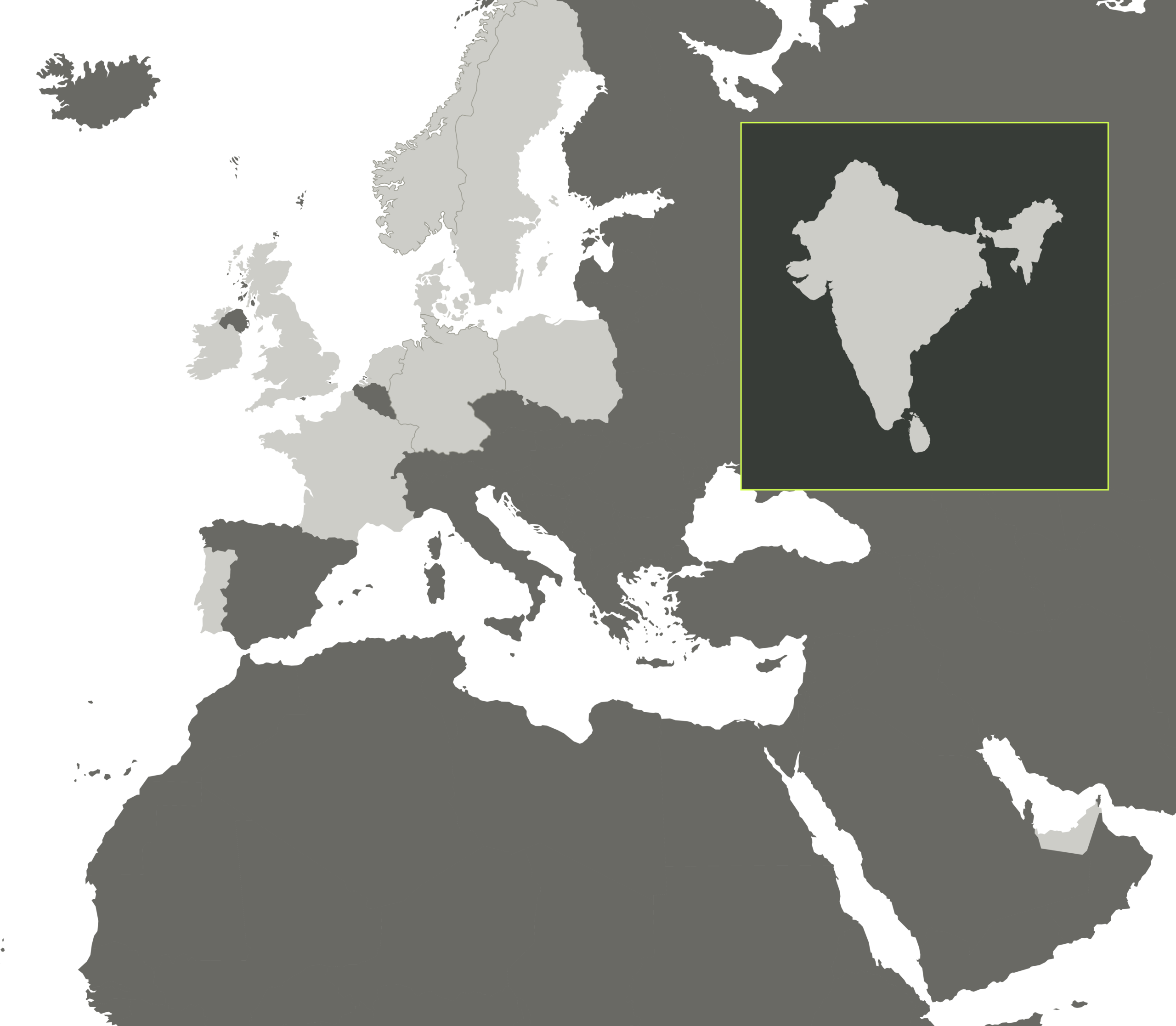
Development centre in India
Remote
Utilizing a global workforce of IT experts
On premise delivery in Denmark
On premise delivery in the United Kingdom
On premise delivery in Sweden
On premise delivery in Norway
On premise delivery in Germany
On premise delivery in France
On premise delivery in the Netherlands
From our development centres in Poland
From our development centre in Portugal
From our development centre in India
On premise delivery in Ireland
On-premise delivery in the The United Arab Emirates

At emagine, we cultivate a culture of openness and integrity to foster meaningful and strong relationships with clients and consultants.
Attention leads to partnerships
Our ability to listen, understand and adapt to our clients' and consultants' unique challenges and priorities enables us to create real impact and value, ultimately leading to meaningful partnerships.
We are emagine, and we hear you.
We are emagine
emagine is a high-end business and IT consultancy. Enabled by an extensive network of experts, we power progress, solve challenges, and deliver real results through tailored high-end consulting services.
For consultants
Your gateway to rewarding projects
Get access to exciting projects with some of the most well-renowned brands in the market. We are your partner all the way.
Become a consultant
Discover how we can help you become a successful consultant. Join our extensive European network of experienced specialists who make a difference for leading companies every day.
 What’s your challenge?
Let us know about the challenges you face and needs you have. We are curious to learn more about you.